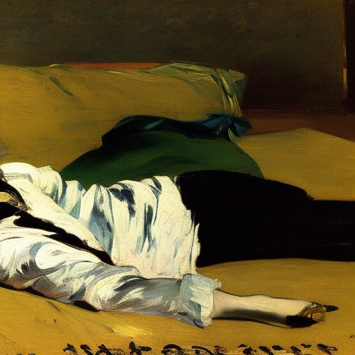
[Written by ChatGPT. Main image: “Olympia,” headless (SD 2.1)]
When creating AI-generated art, the size and aspect ratio of the final image are as crucial as the subject matter itself. In our recent experiments with the Stable Diffusion model on DreamStudio, we’ve been exploring how varying aspect ratios affect the final artwork, especially when the subject matter is highly specific and recognizable. Our journey began with the realization that using the default 1:1 aspect ratio often resulted in unsatisfactory images, where important elements, like the subject’s head, were frequently cropped off.
The Olympia Challenge
The first subject we revisited was Édouard Manet’s famous “Olympia”. The prompt was: “Reclining woman, black cat at feet, gaze towards viewer, realism, Édouard Manet.” However, experimenting with the 16:9 or 3:2 aspect ratios resulted in images that were not only oddly stretched but also frequently had important elements, such as the woman’s head, cut off from the frame. This prompted us to realize that the model was struggling to fit the subject within the given aspect ratio, leading to distortions.


The “David” Dilemma
Next, we turned our attention to Michelangelo’s “David”. The prompt we used was “Standing male figure, slingshot over shoulder, stone, Renaissance, Michelangelo”. We initially experimented with the 9:16 aspect ratio, which unfortunately produced grotesque and slightly horrifying results. Scaling it back to 4:5 yielded better outcomes, but the model continued to crop out critical features.


Water Lilies: A Success Story?
Our third experiment was based on Claude Monet’s “Water Lilies”. The prompt was “Pond, water lilies, weeping willow, reflections, atmospheric, Impressionism, Claude Monet”. We used a 1:2 aspect ratio for this experiment. The results were less disturbing, but the images still seemed a bit off, suggesting that aspect ratio manipulation remains a challenge for the AI.


Repetitive Forms and Tessellations: A Better Fit
Interestingly, prompts that encourage repetition or pattern, like abstract forms or tessellations, seem to adapt well to larger formats like 9:16. For instance, our “Guernica” prompt (“Monochrome, chaotic scene, suffering people and animals, abstract forms, anti-war, cubism, Pablo Picasso”) and a simple M.C. Escher-inspired prompt (“tessellation, M.C. Escher”) resulted in images where the forms or patterns simply multiplied to fill the available space. This confirms our hypothesis that more free-form, pattern-based, or repetitive works would naturally expand to accommodate different aspect ratios.


Final Thoughts
Our experiments with aspect ratios in Stable Diffusion have been enlightening. It’s clear that AI has some difficulties with certain aspect ratios, especially when human figures are involved. This led to distortions and unexpected cropping of key features. However, as expected, abstract and less human-centric themes seem to adapt better to different aspect ratios. These observations offer valuable insights into the workings of AI in art generation and underscore the significance of considering aspect ratios in AI-driven artwork.
Categories: Image

Leave a Reply